Portfolio
UI & UX Design
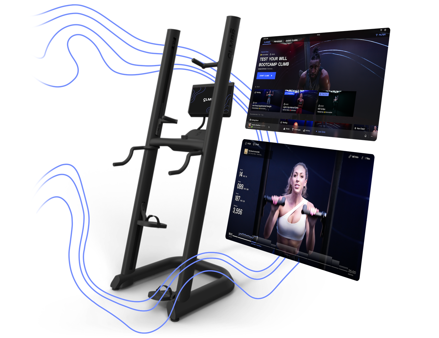
At Nicer Studio we designed and developed apps for CLMBR that efficiently and stylishly empower users to reach new heights. As I worked on the exercise machine app, mobile app, and website I designed significant new sections of each of them and solved critical UI & UX problems.
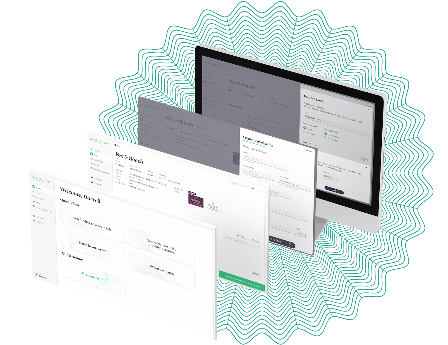
I worked alongside Earnnest’s creative director to design a support dashboard that allows Earnnest’s customer service team to easily navigate and filter payments. I followed brand guidelines while creating an excellent user experience that is beautiful, functional, and efficient.
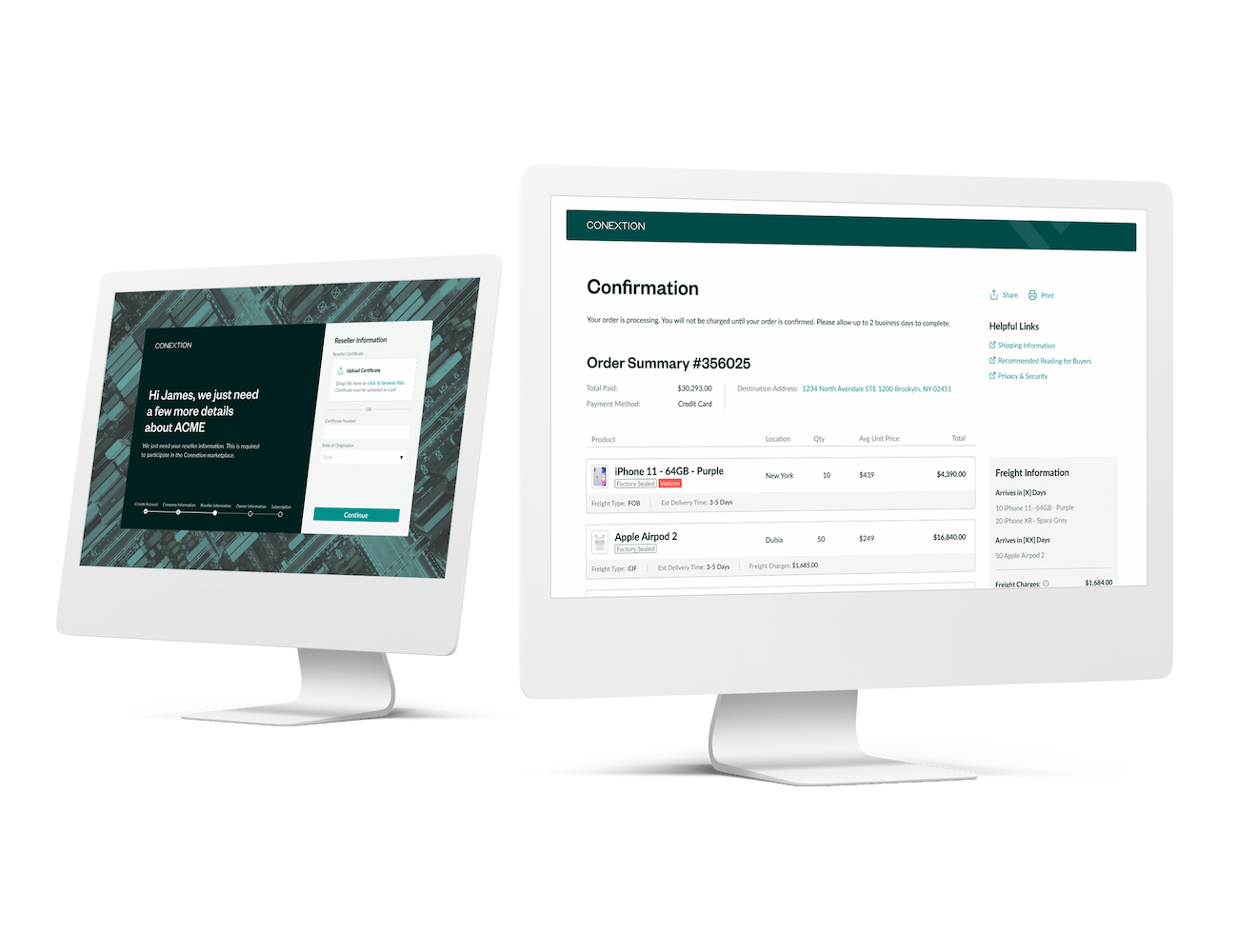
I worked within Conextion’s established design system to enable the use of new payment methods by updating the checkout process and signup flow. I also reworked aspects the layout to be up to date with new features and standards in Figma, making it easier to work on in the future.
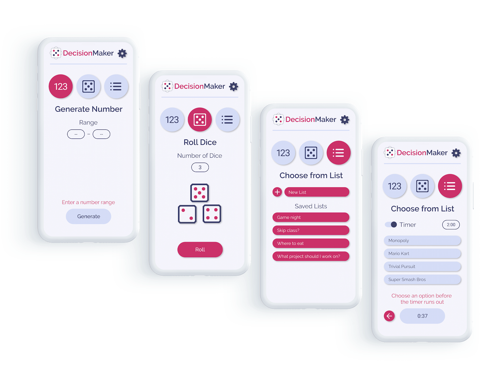
DecisionMaker is an app I designed to enable users who are indecisive or just have too much on their plate to deal with all the small daily decisions that pile up and create stress. It lets you to use randomized numbers or saved lists to easily make repetitive decisions.

Branding & Logo Design
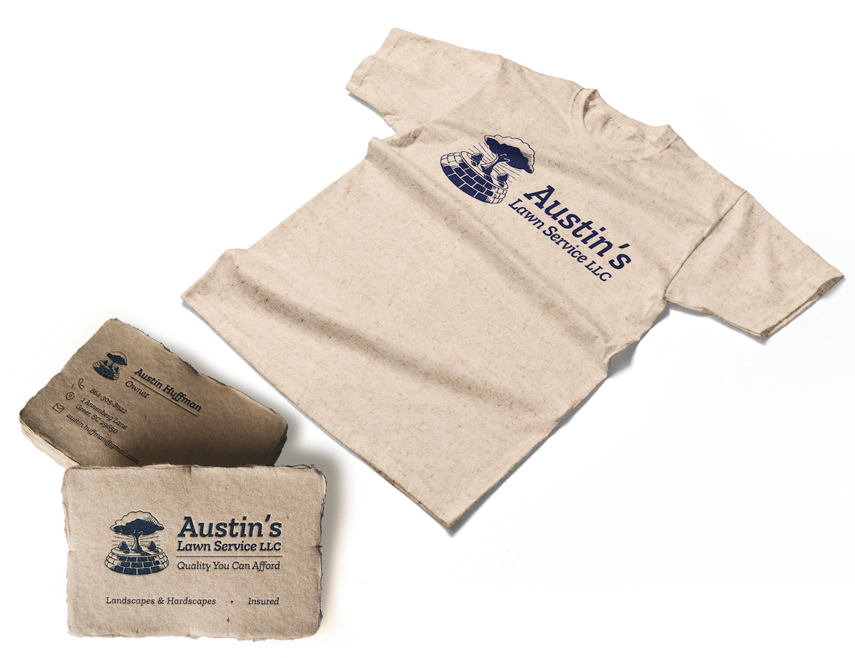
This brand I created for Austin’s Lawn Service was designed to be both appealing to younger adults yet familiar and to older generations. I achieved this by using a vintage illustration style which feels fresh yet trustworthy, all while giving the brand a unique & impactful visual identity.
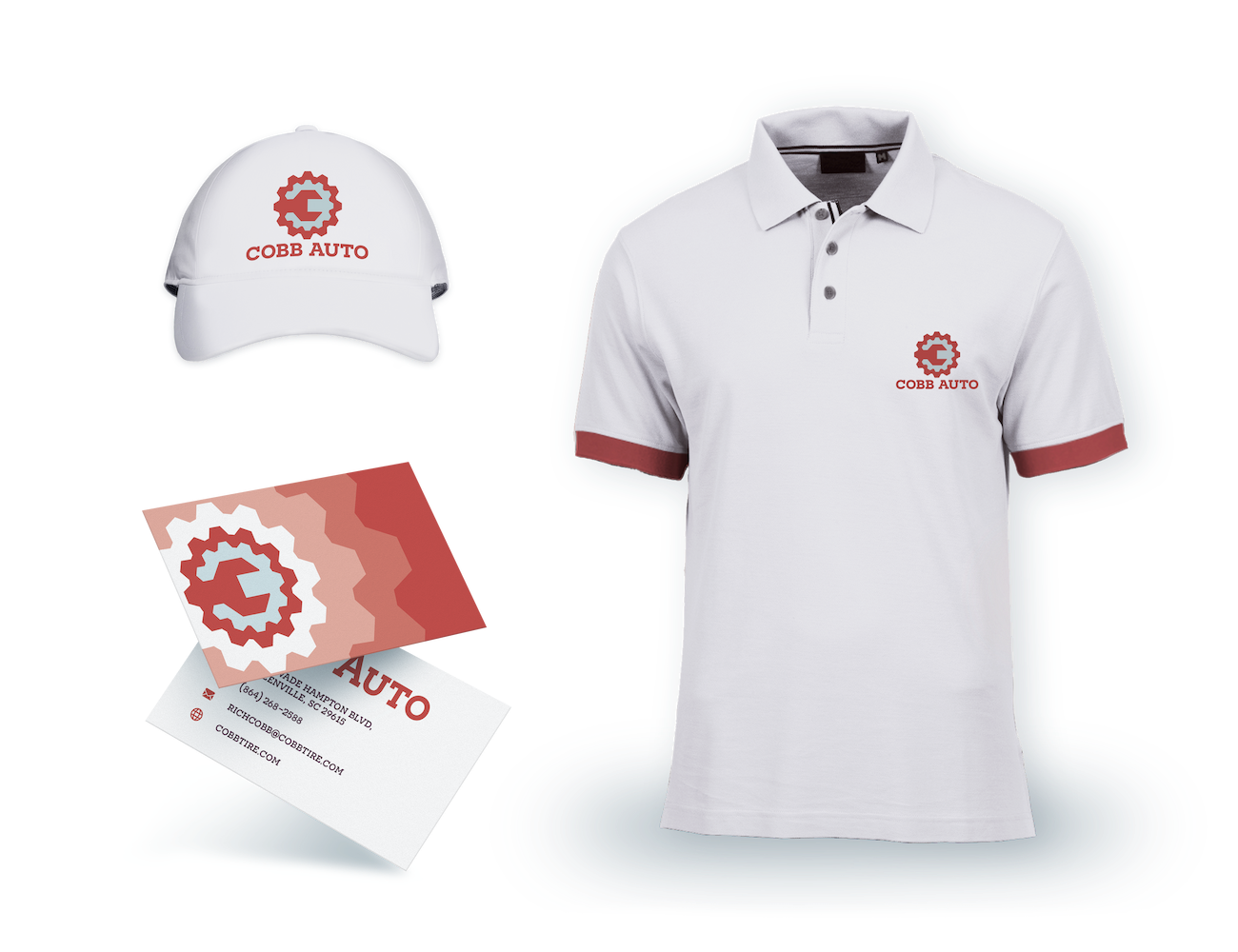
After researching Cobb Auto’s company, history, and target market, I found inspiration in 70s illustration and design. The logo combines a gear, wrench, and letter C to create both a lettermark and an icon. The mechanical geometric typeface, rustic red, and steely blue all combine to create a retro yet clean aesthetic.
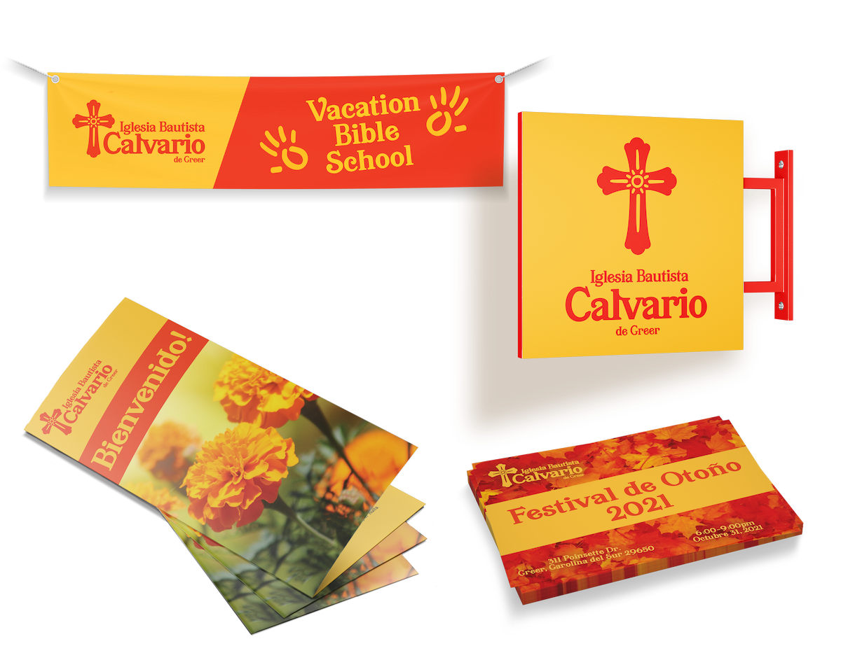
When rebranding this hispanic church, I wanted to create a brand that felt authentically hispanic. So I researched Spanish & Mexican art, design, and typography, then pulled them all together. The colors and accents were inspired by Mexican folk art, while the cross shape and typography are influenced by Spanish culture.

Poster Design
Cosi fan tutte
Fog
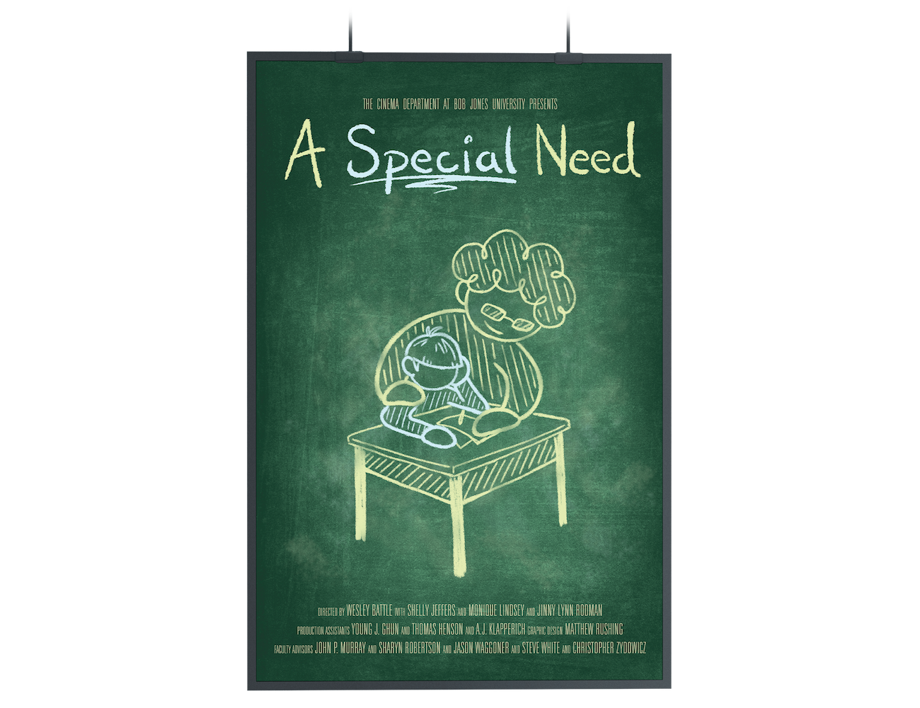
A Special Need
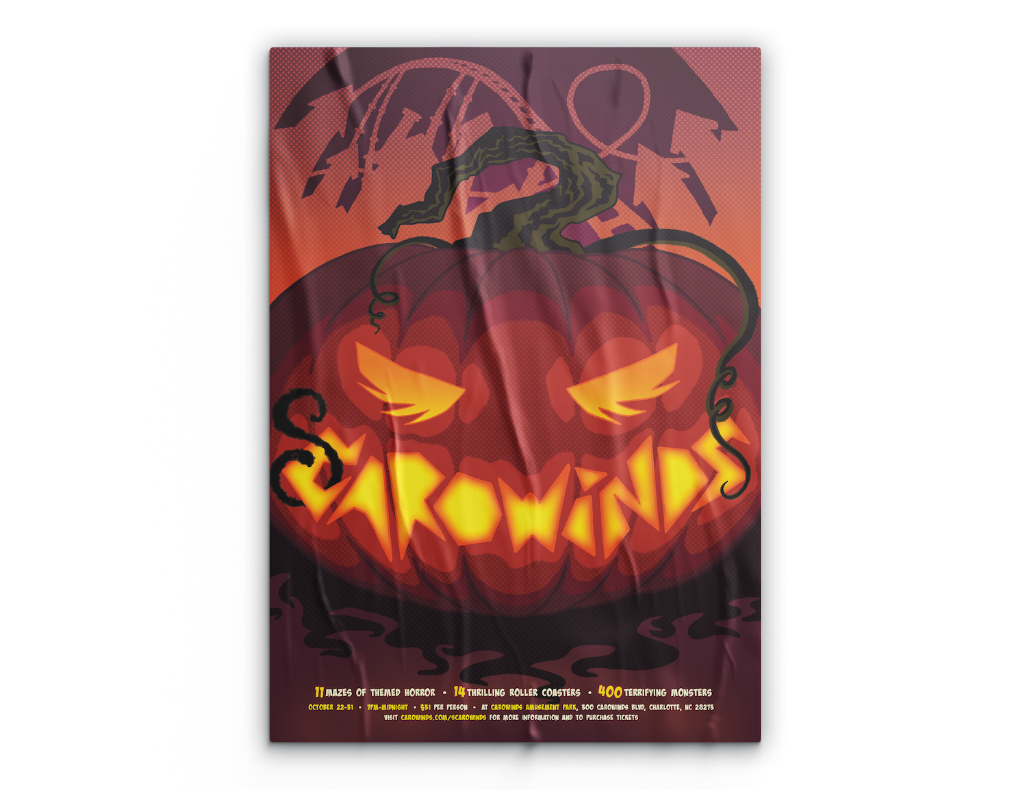
Scarowinds
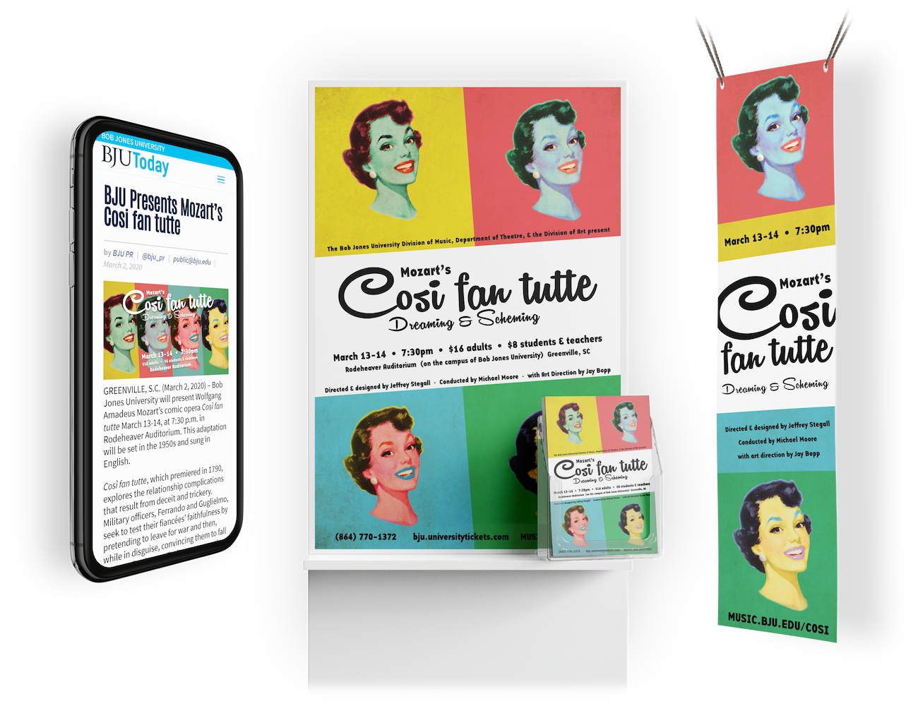
I created the event materials for this Mozart-turned-1950s production. I was inspired by Andy Warhol’s prints of Marilyn Monroe as I worked with the director to create a stunning poster, web graphic, and outdoor banner that excited and enticed viewers.
When approaching this poster for a film about special needs teachers, I went for a playful chalkboard drawing aesthetic that communicates the classroom setting. I used blue and yellow to represent the child and teacher to show that the teacher is giving hope to her student.
While researching for this Halloween themed poster illustration, I was inspired by the aesthetic of old Batman comic books. I incorporated this style through use of halftone-dots and my choice of brush, as well as the hand carved pumpkin lettering and expressive typography.

Illustration
Editorial Illustration
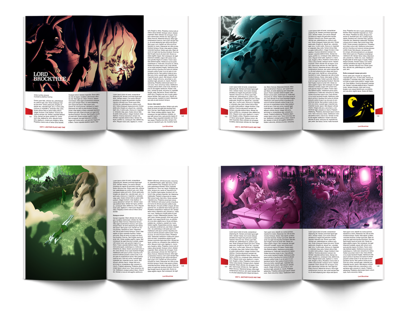
Brocktree Series
The 5th Wave
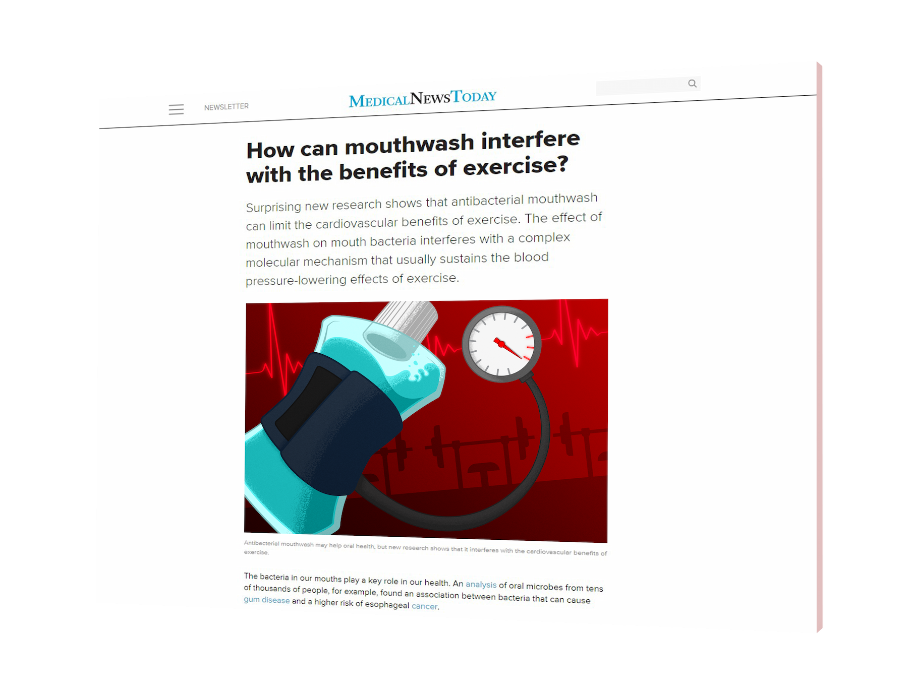
I created this illustration to accompany an article about how using mouthwash can decrease the benefits of exercise. I limited my color pallete to make it simple to understand at a glance, and used textures and simple shapes to make it visually interesting yet clear & communicative.
This is a set of four illustrations I created to accompany "Lord Brocktree," a book in the Redwall series by Brian Jaques. These illustrations are unified by their consistent use of color, texture, and linework. Each image has its own distinct tone and mood, yet their similarities help them work together as a unified series.
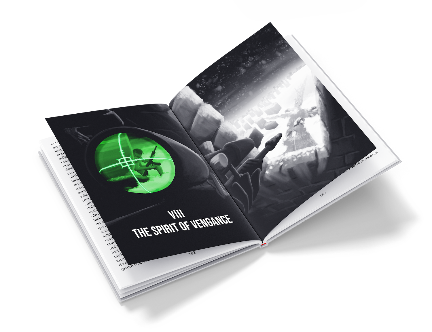
In this illustration I used a more sophisticated oil painting style to complement the more mature setting of the book. I also created a dynamic angle that communicates the height and advantageous position of the sniper. I limited the color pallet to only grayscale and green to make the sniper’s target the focal point of the image.

About
Hi, I’m Matt Rushing
I am a highly creative, innovative, and hard-working designer, motivated by a desire to constantly learn, grow, and improve. I have a wide range of experience from branding to web design to illustration. I love problem solving and using design to create engaging and efficient visual solutions. If you would like to work with me, send me a message so we can work together to bring your ideas to life.
My Design Philosophy
My interests reach into many different fields of graphic design. While I am focused on UI and web design, I am also experienced in illustration, photography, hand lettering, branding, and poster design. These interests all influence each other, allowing me to approach my designs from a unique angle depending on the needs of the design. My illustration experience helps me create logos and icons that are visually interesting and thematically cohesive with the brand or app that I am working with. I also incorporate hand lettering to create logos with unique typography that fits the brand, rather than just using an ordinary typeface choice. Each design I create builds on what I have learned from my past experience, allowing me to grow and innovate as a designer.
Part of what I love about graphic design is the process of creative problem solving. It is so satisfying to start with nothing but a concept and put together all the puzzle pieces needed to create a visual solution. I begin my design process by researching the project to fully understand its needs, purpose, and function. Understanding the project is essential to creating a design that not only looks appealing, but also communicates effectively and functions as expected. I then research further to find an aesthetic that fits the project. This could be as simple as choosing a minimalistic style or an ornate geometric design, but I often find more specific inspiration, such as Mexican folk art or Andy Warhol’s prints. I adapt the style to fit the needs of the project by simplifying or altering, as necessary. Through my process I hope to create designs that are both stylish and unique while still being useful, intentional, and effective at communicating to the user.
Work Experience
Drum Creative ›
(April 2022–present)
We design everything from websites to brands, to help our clients make a great first impression, communicate their story, and engage with their target audiences.
BJU Press ›
(February 2022 – April 2022)
We worked to create textbooks that blend useful, readable, and visually engaging layouts that not only inform students but also give them a passion for the subject.
Nicer Studio ›
(2021)
We design and develop apps that efficiently and stylishly empower users for CLMBR, Conextion, and other exciting startups.
Austin’s Lawn Service LLC ›
(Summer 2021)
I researched and iterated on designs to construct a powerful new brand identity to be used in a wide range of applications, from t-shirts to business cards.
Earnnest ›
(Spring 2021)
I communicated with the creative director to design a useful & aesthetically pleasing customer support dashboard that allows Earnnest’s customer service team to easily navigate and filter payments.
Cosi fan Tutte Event Branding ›
(February 2020)
I designed a poster as well as multiple other applications including an outdoor banner and a web banner by working with the director to develop the production’s aesthetic.
Contact
© 2021 • MattR Design • All Rights Reserved
